In the 19th century, James Maxwell demonstrated the nature of colour vision by showing that all colours could be additively created based on the primary red, green, and blue using spinning disks at high speeds, producing a visual blend of colours. In contemporary times, Maxwell’s disc concept has been expanded and integrated into various colourimeters and spectrophotometers, employed to measure and quantify the properties of light and colour in diverse settings, including the CIE 1931 colour space.
The CIE 1931 colour space, also known as the CIE XYZ colour space, is an international standard for representing and defining colours. It was created by the International Commission on Illumination (CIE) in 1931 and is based on the human visual system and takes into account the sensitivity of the average observer to different wavelengths of light. It defines a colour as a set of three numerical values, X, Y, and Z, which represent the amount of red, green, and blue light that is needed to match the colour being measured.
In practice, the CIE 1931 colour space is often used in colour management, quality control, and colour matching because it is device-independent, meaning it can be used to accurately describe colours across different displays, printers, and lighting conditions.
It is important to understand the colour gamut of the cameras and lights that are being used and to ensure that they are matched to the intended colour representation, to ensure accurate colour reproduction and to prevent colour discrepancies.
If the camera or light has a limited colour gamut, some of the colours in the scene may not be accurately represented in the image or output. This can result in a loss of colour accuracy and may require colour correction or adjustments to be made to achieve a more accurate representation of colour.
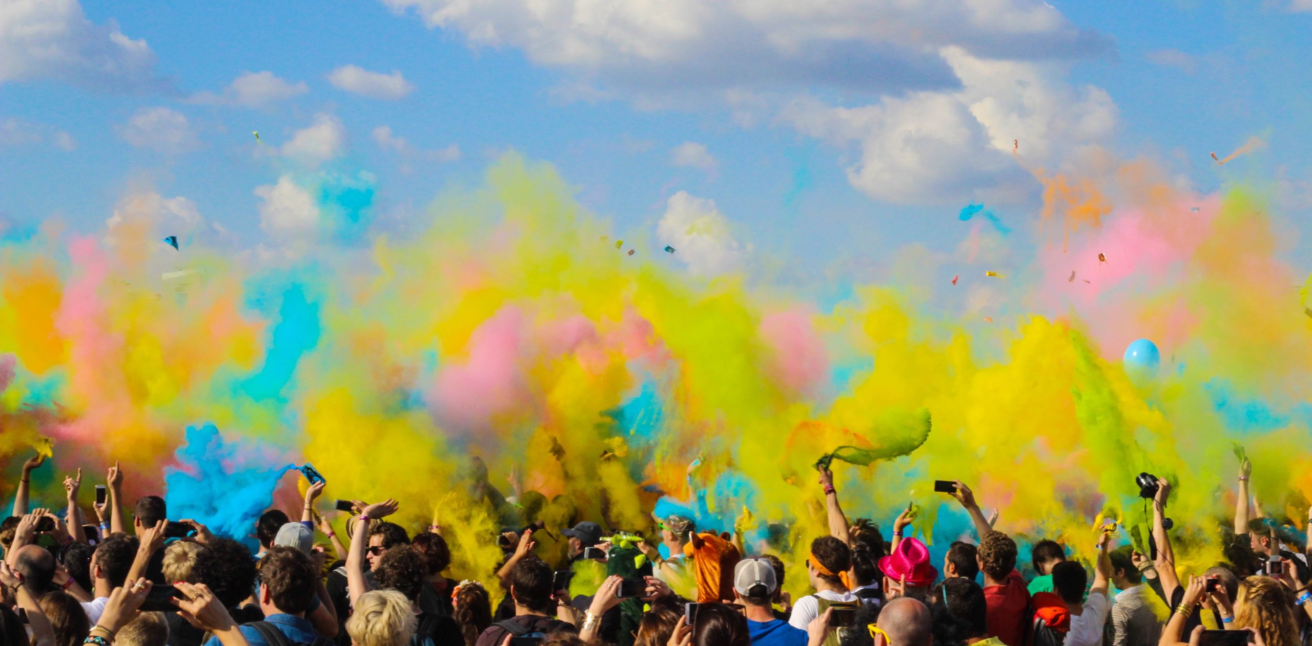
Harmony – Colour Composition
In colour theory, colour harmony is achieved by using colour combinations that are aesthetically pleasing and that create a sense of balance, unity, and order in a design.There are several principles of colour harmony that can be used to create visually appealing colour combinations (image source: colour.adobe.com)
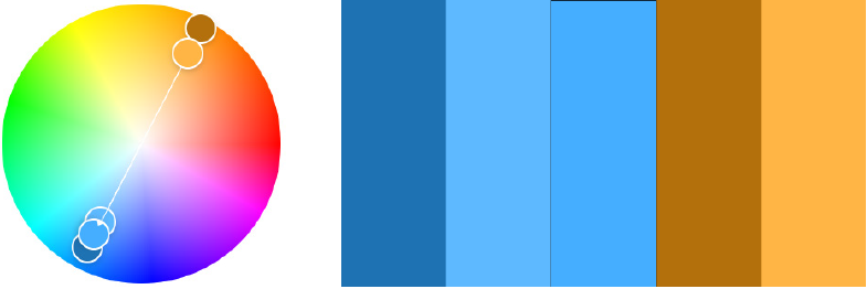
Complementary colours: Complementary colours are pairs of colours opposite each other on the colour wheel. When used together, they create high contrast and can be used to create a bold, dynamic look.
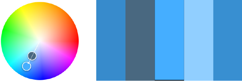
Monochromatic colours: Monochromatic colours are different shades and tints of the same colour. When used together, they create a cohesive and harmonious look, and are often used to create a calming and soothing atmosphere.
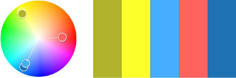
Triadic colours: Triadic colours are colours that are evenly spaced around the colour wheel. When used together, they create a balanced and harmonious look, and are often used to create a vibrant and energetic atmosphere.

Split-complementary colours: Split-complementary colours are a combination of a colour and the two colours that are adjacent to its complementary colour on the colour wheel. This creates a harmonious colour combination that is less intense than a complementary colour combination.
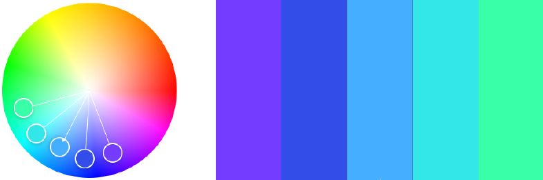
Analogous colours: Analogous colours are colours that are adjacent to each other on the colour wheel. When used together, they create a harmonious and unified look, and are often used to create a calming and soothing atmosphere.
Warm vs. Cold Colours
In colour theory, warm and cold colours are used to create contrast and evoke certain emotions in design and art. For example, a warm colour like red can be used as an accent to draw attention to a specific area, while a cool colour like blue can be used as a background to create a sense of calmness.
It’s worth noting that the perception of warm and cold colours can vary based on culture, personal preference, and the context in which they are used. Nevertheless, warm and cold colour associations are widely recognized and used in various forms of visual arts and design.
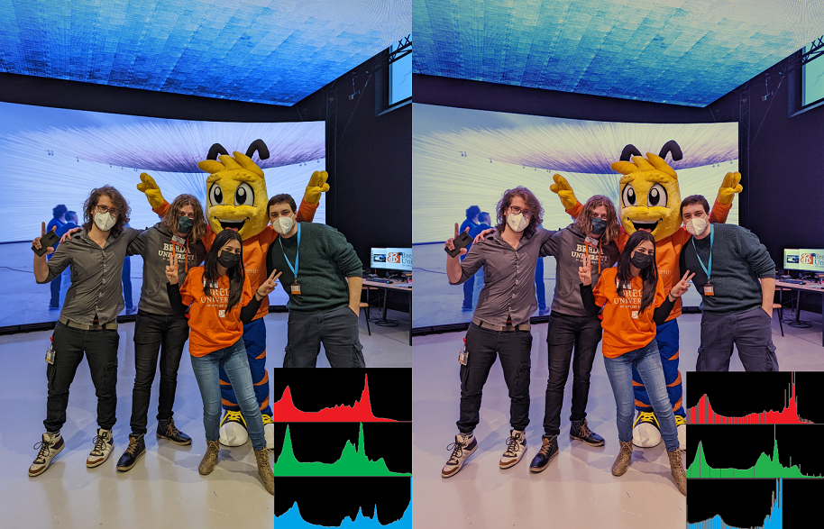
Colour Balance – Histograms
A colour histogram is a graphical representation that displays the distribution of colours in an image or video. It depicts the frequency of pixels associated with specific colour values, thereby facilitating colour adjustments to enhance visual appearance and accuracy.
Colour histograms are used to analyze the colour content of an image or video and to understand the distribution of colours in a scene. They are commonly used in image and video processing, colour correction, and image analysis applications.
By analyzing the colour histogram, it is possible to determine the dominant colours in an image or video, to identify any colour imbalances, and to make colour adjustments to correct these imbalances. For example, if the colour histogram shows that an image has a dominant blue colour cast, colour correction can be applied to reduce the blue cast and to achieve a more neutral colour balance.
A blue colour cast means that the entire image has a blue tint, making all colours look blueish. This can occur due to incorrect white balance settings on the camera, lighting conditions, or other factors. One common method is to adjust the temperature and tint settings, and reduce the blue cast and achieve a more neutral colour balance.
Macbeth chart
The exact correction will depend on the desired tone and style.
A Macbeth chart, also known as a Macbeth Colour Checker, is a colour calibration target used in photography, cinematography, and other imaging applications. It is a standardized colour chart that consists of 24 square patches of various colours, including neutral grays, skin tones, and primary and secondary colours.
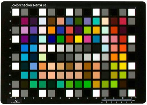
The purpose of the Macbeth chart is to provide a reference for colour accuracy and consistency. By photographing or scanning the chart, you can analyze the colours captured by a camera or scanner and determine if they are accurate and consistent. This information can then be used to make adjustments to the camera or scanner settings to ensure that the colours are captured correctly. In addition to colour calibration, the Macbeth chart is also used in colour grading, which is the process of adjusting the colours and tones in an image or video to achieve a specific visual style or look.