What is user experience (UX) design?
User experience (UX) design is a process with the objective to design products that provide accessible, efficient and relevant experiences to users. UX design is about designing the experience of product use, the way users interact with said product, and the functions within said product. The main focus is enabling seamless goal achievement for the users.
What is user interface (UI) design?
User interface (UI) design is a process with the objective to design a ‘front-end’ interface with clear audio-visual communication and pleasing aesthetics, to aid in the efficiency of use and achieve the objective(s) set during the UX design phase. In a conventional application sense (e.g. a web or native application) UI design thus refers to the audio-visual appearance – ‘the look and feel’ – of an app that will aid the function of a product. It focuses on visual factors such as the colour palette, fonts, imagery, buttons, other interactive elements etc, as well as sound or audio effects of any kind.
UX & UI design – Step-by-step process
- User research. Define and research the target audience. Learn about the user’s behaviour, needs and goals, to build a strong foundation for the design strategy and create an optimally adapted product. Oftentimes, user personas will be created. Define the main use case(s) based on the acquired information.
- Interaction design & information architecture. Consider what actions users would want to take using a product and translate this to a set of core functionalities and features. Create a user flow for each action, aiming to make it completable in a minimal amount of steps. Also consider the general flow of the experience. Such a ‘customer journey’ should focus on helping the users find and achieve what they are looking for through an intuitive process. Think about the organisation, structure and labelling of content; content priority, the allocation of space etc. Create wireframes and/or mock-ups to experiment with different compositions.
- Visual design. Consider what aesthetic response (‘vibe’ or ‘feel’) the corporate style should evoke, how to draw the eye to the core functionalities and features, how to visually convey content priority, font type and size, colour palette, white space, animated cues etc. It is important to take limitations or restrictions such as colour blindness into account in this design phase.
- Prototyping. Experiment with ideas by making simple and testable mock-ups in which the various design directions from the previous steps get implemented and tested. Eventually, one- or a combination of prototypes will lead to the final concept that will get further developed.
- User testing & usability evaluation. Test prototypes with the target audience to create a consistent feedback loop. Results from these tests might lead to a return to step 3 or 4.
- Implementation & production. Translate the acquired knowledge from the user tests into design decisions and implement the changes. Consider how to improve on the issues that users frequently run into. Repeat the ‘user testing & usability evaluation’ step until a strong final product emerges.
UX & UI outcome
What is important to consider for good UX design? The ‘user experience honeycomb system’ by Peter Morville considers seven important elements:
- ‘Is it useful?’ The product must fulfil a user’s need. Is it helping the users achieve their goal in a logical and cohesive way? What are the feature requirements to achieve this?
- ‘Is it usable?’ How quickly and efficiently can a user operate the product?
- ‘Is it desirable?’ There is more to a product than whether it is usable and useful. The product should be interesting and aesthetically pleasing to elevate the product experience. This is an emotive element, focusing mainly on image and branding than functionality.
- ‘Is it findable?’ Is the product easy to find and access? Is the internal navigation to find information or reach a certain goal streamlined?
- ‘Is it accessible?’ Do all users from different backgrounds and with different abilities experience the product in the same way? Is it usable for everyone?
- ‘Is it credible?’ Provide a consistent and coherent service that the users can trust to make a product credible. It will greatly contribute to a positive user experience if the users feel the product is safe and secure.
- ‘Is it valuable?’ Does the product bring value to the user? No matter how usable and desirable a product is, if it lacks inherent value, it is unlikely the user will return.
What is important to consider for good UI design? Multiple of the following design principles are part of Jakob Nielsen’s ‘10 Usability Heuristics’.
- Status visibility & informative feedback. Ideally, users should always be informed of what the system is doing through appropriate feedback within reasonable time. Provide feedback for all user (inter)actions (Example: password strength). Immediate feedback will acknowledge that the application has received an input, reduce the level of uncertainty, reinforce the sense of manipulation, and prevent a user from potentially making mistakes (Example: clicking the same button twice). Actions should be organised into groups with a beginning, middle and end. Informative feedback at the completion of a group of actions gives users the satisfaction of accomplishment and a sense of closure (Example: A confirmation page after completing an order).
- Error prevention & tolerance of mistakes. Prevent errors from occurring as much as possible. (Example: by implementing smart defaults, confirmation requirements, greyed out unavailable items, preventing typing alphabets in number fields etc.). Provide feedback and a way out when an error does occur. Communicate the cause and how it can be rectified in comprehensive language (Example: by implementing methods of cancelling, such as an undo and redo function). In the context of the systems selected for ILIAD, error prevention must also take into account the use and the potential for errors in numerous third-party systems.
- Help & documentation. Even though it is better if a product can be used without documentation, it is still necessary to provide help in case of need. Such documentation doesn’t need to be visible at all time but should be easy to retrieve. The informational contents should be easy to search, focused on the user’s task, list concrete steps and not be too large to avoid information overload.
- Clarity / real world and product connection. A product’s interface should align to concepts, terminology and language already familiar to the user. Do not reinvent the wheel. Instead, reuse conventions and patterns that have proven effective in the past and exist across other platforms. Familiarity cultivates comfort and trust. It gives the users a sense of control, thus enhancing the user experience of a product.
- Reduce cognitive load. To maximise usability, reduce the load on memory by relying on recognition instead of recall. The number of cues that can help memory retrieval are much fewer for recall than recognition, making recall more mentally intensive and error-prone. The user should not have to remember information located elsewhere in the application in order to understand and properly interact with the elements on the current screen. As mentioned before under ‘help and documentation’, instructions for use of the system should be easily retrievable whenever necessary.
- Consistency. All repeated content within an application should be uniform: it should have the same visuals and functionality. Consistency limits the number of ways content is represented, allowing users to get familiar with the interface more easily and faster. This applies to everything from patterns to terminology. It ensures that users do not require to learn new representations for each task / action. Consistency creates a sense of control, familiarity and reliability, thus reducing the cognitive load and improving the clarity of the product.
- Minimalist design. Good UI design is practical, not decorative. Less is more. Overly decorative designs create unnecessary distraction from the elements that are truly relevant to the user. Do avoid overwhelming the users, define a main focus point for each screen, clearly convey its purpose and the required (inter)actions to maximise visibility and clarity. Avoid unnecessary complexity by cutting down on the amount of irrelevant or rarely needed information.
- Ease of use. An interface should remain simple and easy to use for the average person. Generally, users should not need training in order to use a product. Accommodate both novice and advanced users, while still tailoring the experience.
- Accessibility. It is important not to assume that users are like you, or the people in your direct environment. This goes for technical knowledge and abilities, but also opinions and general point of view. We often fail to consider minorities or people that are in other ways far removed from ourselves. It is important to design with our possible differences in mind, such as motor, cognitive or visual impairments.
Our implementations within MSP Challenge
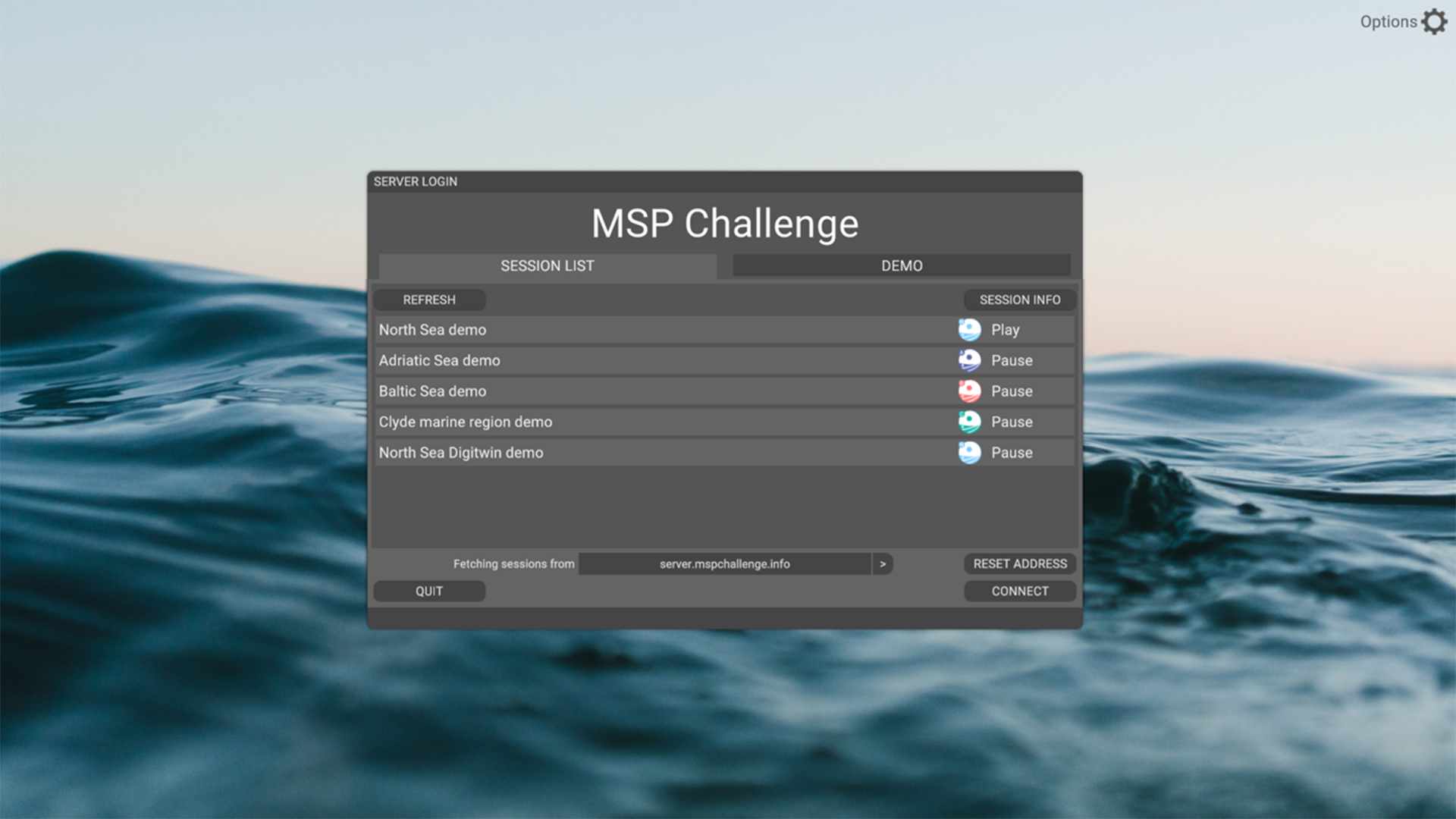
1. Login Screen
The purpose of the login screen is to provide the user with a clear and welcoming introduction to MSP Challenge.
Previously, the login screen closely resembled ‘launchers’ used in many traditional video game titles.
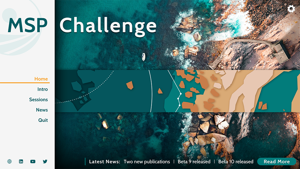
It has been our goal for a while to turn the login screen into a hub-location, not only containing the session browser but also general information about MSP Challenge, software update announcements, news etc.
When redesigning the login screen, we stepped away from the ‘game launcher’ layout, as it didn’t properly represent our vision for MSP Challenge.
MSP Challenge classifies as a serious game and while we strive to incorporate storytelling, challenges and immersive roleplaying elements into the experience just as traditional video games do, its purpose isn’t solely entertainment. We believe that MSP Challenge is a strong planning software. With its access to real-life data, Ecopath with Ecosim models, simulations and an extensive set of tools for marine and maritime spatial planning, MSP Challenge can assist in research & development projects, stakeholder engagement and education, to name a few possibilities.
We decided to go for a more conventional design that our target audience is more likely to be familiar with.
All the information that was previously featured together in the launcher has now been divided over a set of screens that the user can easily access through the fixed left-side menu.
2. Tutorial Mode
Though we strive to make the user experience of MSP Challenge as clear and streamlined as possible, it will always remain a complex piece of software with extensive in-game possibilities. The purpose of the tutorial is to provide new users with a general introduction in order to smoothen the initial learning curve. Once completed, the users should have a general sense of what the game is about (i.e., the notion of multi-player marine spatial planning), and of the steps they can take in order to progress in the game.
When starting up MSP Challenge for the first time, new users will be prompted with the option to follow the tutorial, which they can either accept or decline.
The tutorial consists of informative pop-up overlays integrated in the actual game software, instead of being a complete separate and simplified interface. It guides the users through the core features required to get started step by step, while simultaneously introducing them to the complete software. The tutorial is an opportunity for- and encourages more adventurous users to already start exploring the rest of the interface and learn through trial and error.
Eventually, the majority of the features will need to be to be applied during an MSP Challenge session, so the sooner users get the chance to explore them the better.
The tutorial will occasionally require the users to fulfill simple tasks before they can proceed, such as consulting a specific window or creating a simple spatial plan. This avoids users from accidentally or purposefully skipping past important information.
The tutorial is divided into four sections. As the name indicates, ‘Part 1 Interface Basics’ introduces the users to the very basics, such as how to maneuver through the interactive map and where to access important windows such as the Main Menu and the Help Windows.
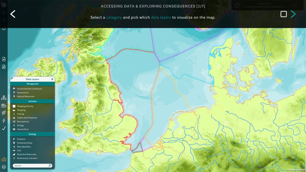
‘Part 2 Accessing data & exploring the consequences’ introduces the users to the data layers catalogue, the legend and the impact tool. This gives the users a first impression of what is already going on in the sea basin.
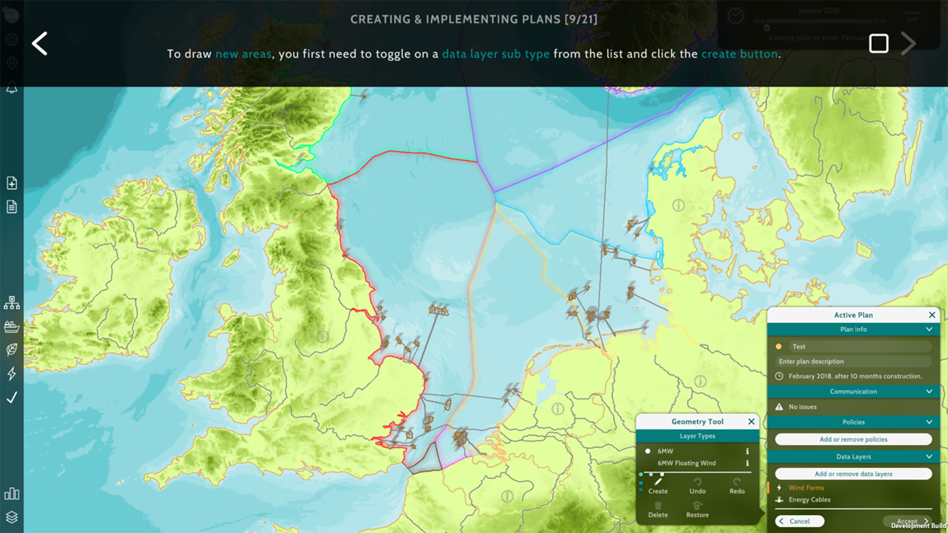
This then seamlessly leads to ‘Part 3 Creating & implementing plans’, which shows users how to turn their ideas into actual spatial plans, how to draw new- or edit existing geometry, and how to get a plan approved and ready for implementation.
Unlike all previous sections, section four focusses on end-game reflection instead of essential early-game information and functions. ‘Part 4 Evaluating consequences’ shows the users how they can assess the impact and consequences of their plans through the KPI- and Objectives Monitor windows once the simulation has run. This is why once the users wrap up section three, they are offered a shortcut to start the game and skip section four if they wish.
Once completed, the user will never be prompted to follow the tutorial again, but it can be manually reactivated through the ‘Tutorial button’ under the ‘Main Menu window’ (Cogwheel button, top-right corner).
The expectation is that by introducing a tutorial, users will be able to interact with the software with more confidence from the very start and that there will be fewer general questions throughout a session. This also makes it easier for external parties to host their own MSP Challenge sessions, without requiring the presence of an MSP Challenge member.

3. Help Windows
MSP Challenge has various tutorial videos and other helpful information available on the community wiki- and knowledge base websites, which is useful but not very accessible during a session. The purpose of introducing the Help function is to provide the users with guidance on how to interact with a window’s features. It gives them the possibility to troubleshoot their actions within the game software by making information easy to find and pinpointed to what they are doing in that very moment.
Each in-game window has a help function that can be accessed through the question mark button in the top left corner of the window header. Selecting it will trigger a pop-up to open, providing information for all the features available in said window, through infographic-like visuals.
This also makes it easier for external parties to host their own MSP Challenge sessions, without requiring the presence of a member of Cradle.
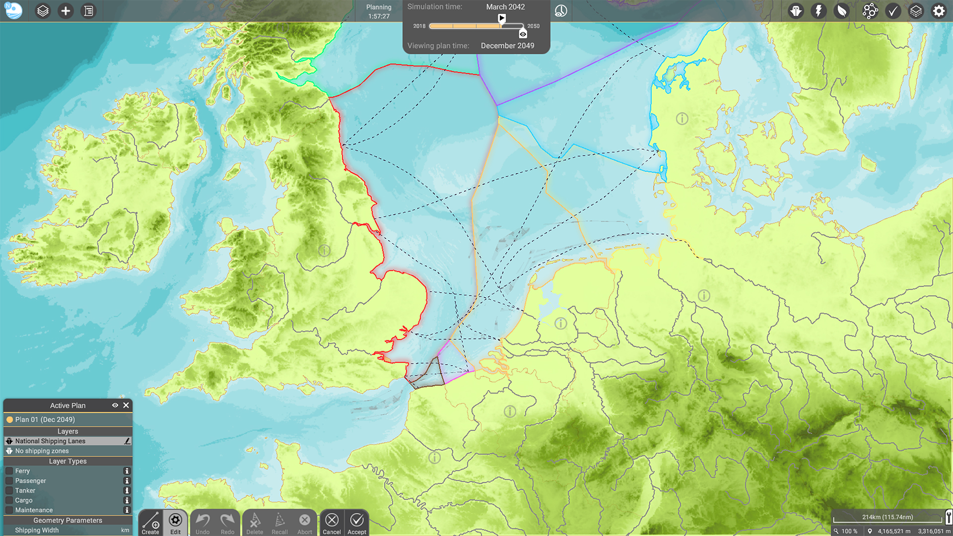
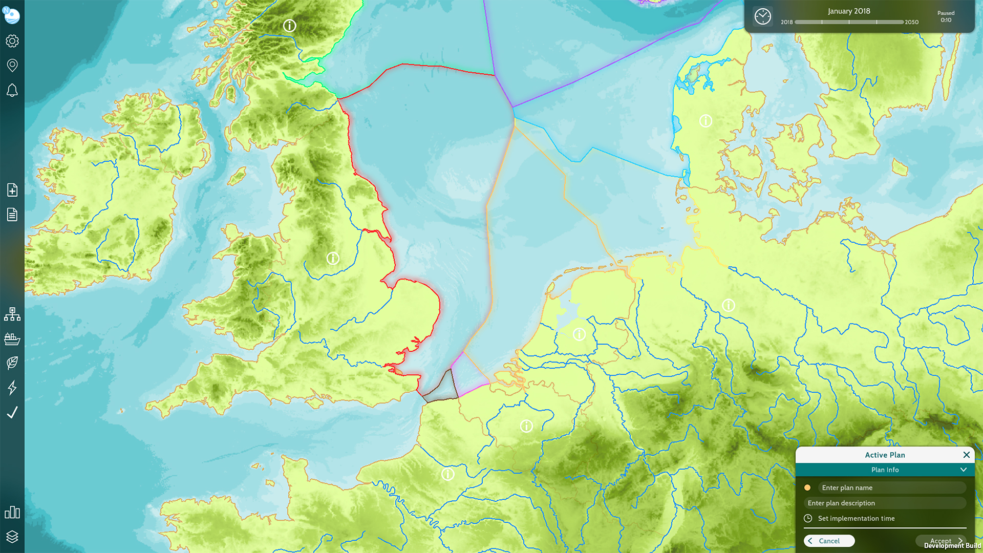
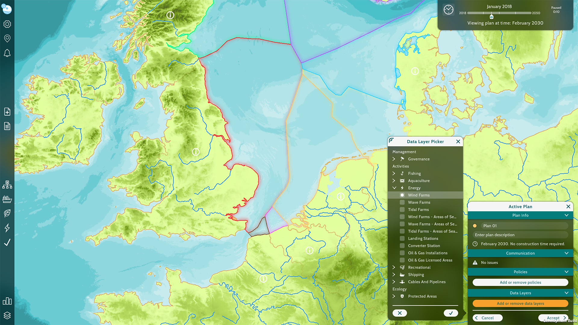
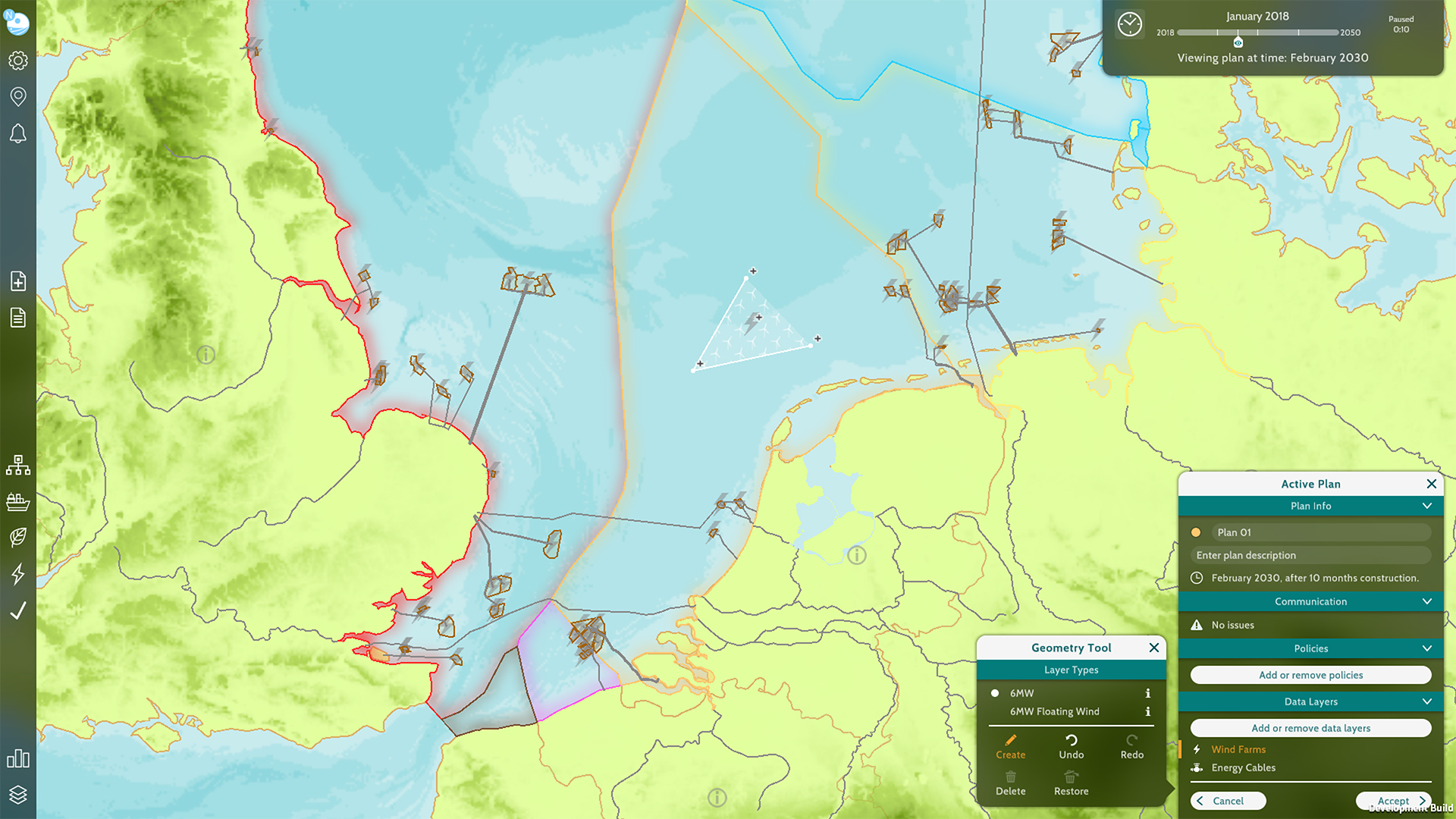
4. Plan Creation Flow – Active Plan Window
The purpose of the Active Plan window is to reduce the number of steps required to create and / or edit a plan, and to combine as many of these steps into one location.
Previously, plan creation and editing required the users to go through multiple steps dispersed over various windows.
First, users are required to fill in a plan name, select the data layers and policies (optional) of choice, and pick an execution date within the plan wizard window.
Once this is done, the plans monitor window automatically opens, in which all the existing spatial plans of the different teams can be viewed. The newly created spatial plan is preselected by default and its contents can be viewed by expanding the window to the right using the arrow button in the header. Simultaneously the active plan window will open in view mode, in the bottom left corner of the screen.
The plans monitor window has multiple tabs, containing various information about the spatial plan. In order to make changes to the data layers of the spatial plan, the user must travel to the layers tab and select the edit button.
The active plan window will expand into edit mode. The users can select one of the data layers that have previously been added to the spatial plan and either select the edit button to make changes to the existing geometry within that layer, or the create button to draw new geometry from scratch.
Once the users have made all the required changes, they need to be permanently implemented by selecting the accept button.
If the users wish to remove or add an additional data layer to the spatial plan, they are required to exit the Active Plan window’s edit mode by either accepting or canceling the changes, return to the Plans Monitor window, select the relevant spatial plan and then select the change details button in the top right corner, in order to reopen the Plans Monitor window in which the original details of the plan were drafted and can be altered.
The active plan window got introduced in MSP Challenge RC1 release.
Reducing the number of required steps / clicks, helps enhance the general flow and clarity of the game. The user is less likely to become overwhelmed if the steps and the information are to the point.
Combining steps and functions that are (thematically) connected and need to be used hand-in-hand into one location reduces the strain on cognitive load.
It isn’t ideal if the user needs to remember how- and where to navigate to (especially if the locations are numerous). This reduces the risk of the user getting side-tracked or even ‘lost’ in the process.
Embracing a complete redesign and combining various steps into one location will allows us to create more consistency in the UI, as many of the current windows were designed and tweaked at different times.
This a good opportunity to implement consistent window layouts, terminology, colours, icons, interactive elements such as buttons, on-hover information etc.